Before
I began by auditing the existing experience to:
- Understand how one-tap enrollment would affect the existing enrollment flow
- Influence the product strategy toward improving the existing experience
What began as a narrow request for one-tap enrollment exposed a larger opportunity to improve how customers browsed and managed Amex Offers. I led the design of a reusable interaction that let customers add an offer directly from the list while preserving access to required legal terms. The team shipped within a year-end engineering deadline, and mobile offer enrollments were up 533% year over year one year after release.
Remove enrollment friction while preserving one-tap access to legal terms and shipping within the existing technical and timeline constraints.
I began by auditing the existing experience to:

I began by auditing the existing experience to:

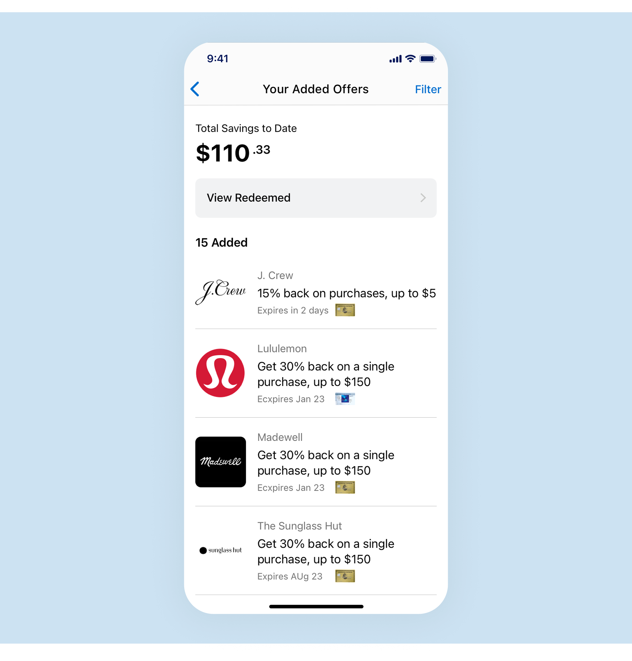
A preliminary exploration to restructure the landing page to emphasize added offers and organize offers into categories.

High-fidelity design used to influence the team’s long-term strategy.
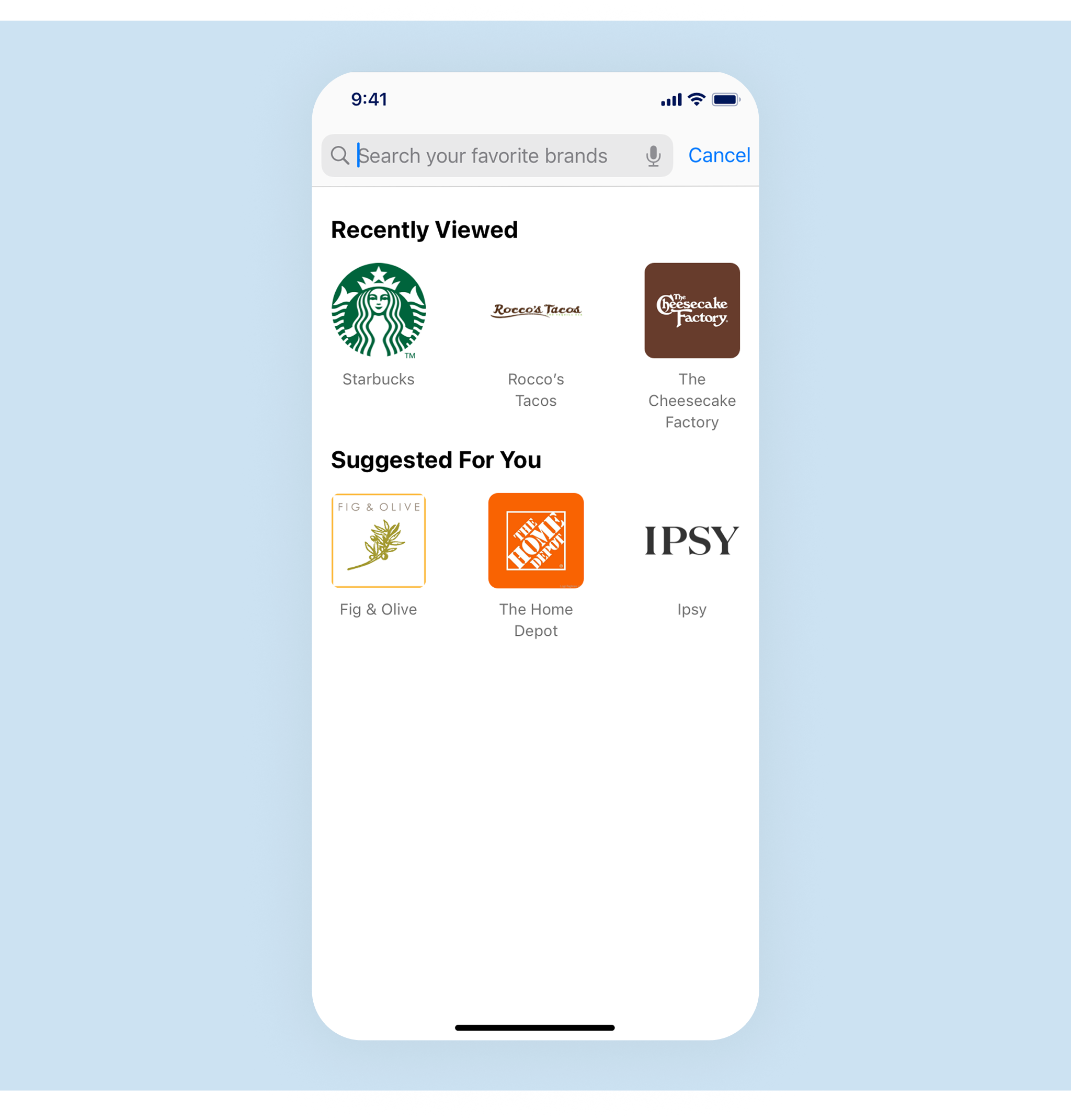

Collections curated by offer category would allow offers to be grouped by theme and let other parts of the app link to these focused views.


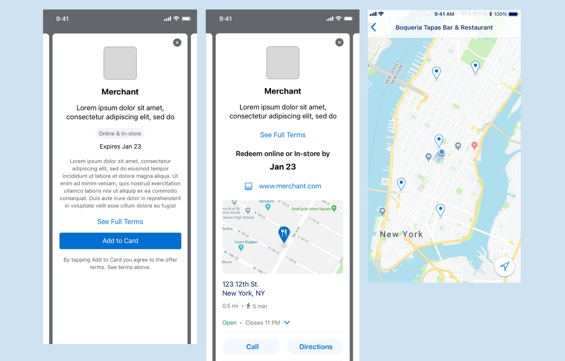
An in-row plus button on the landing page with a bottom sheet confirmation streamlined the enrollment process.

Previous users had to navigate to a detail page to add offers. In addition to one-tap enrollment, I took the opportunity to redesign the detail page with better hierarchy and usability.

A +533% increase in offer enrollments one year from release was a huge success that gave the design team the leverage to push for the long-term strategies explored in the vision.