Summary
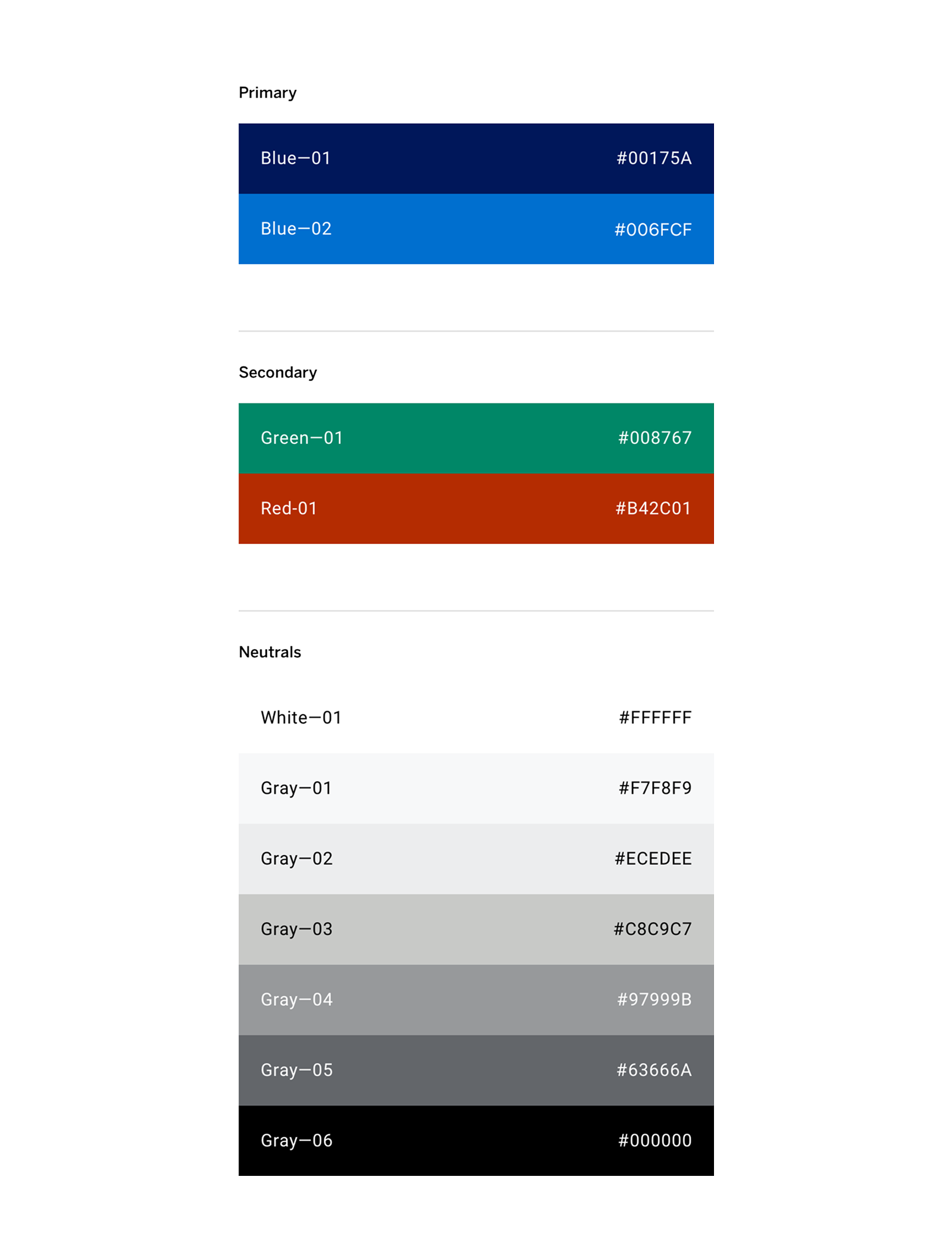
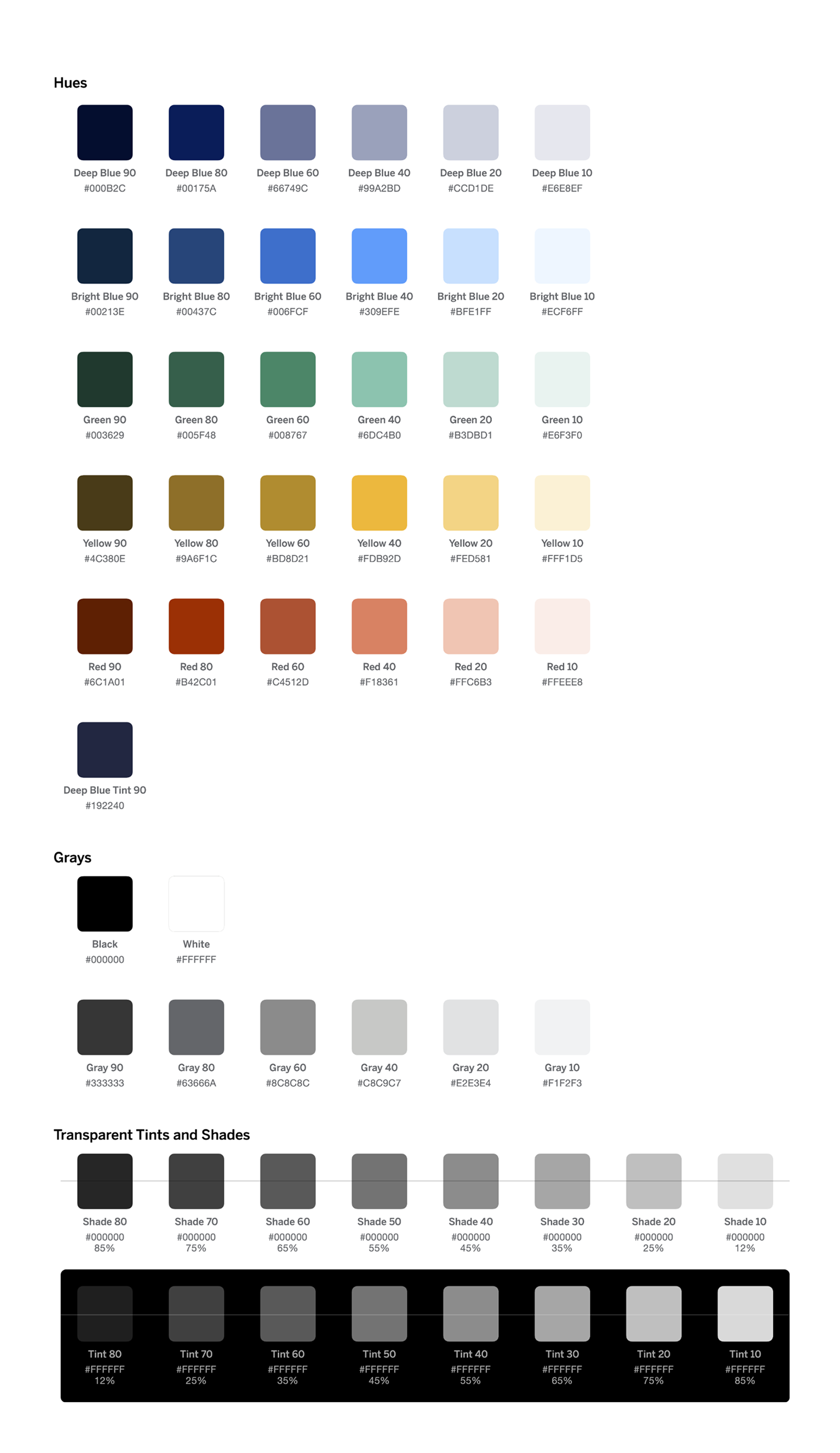
With multiple data visualization projects in flight, the design team needed to extend our current set of colors to use in charts. While exploring a system of colors for data, we took the opportunity to revisit our color system to increase accessibility and make dark mode, a top feature request from customers, possible.
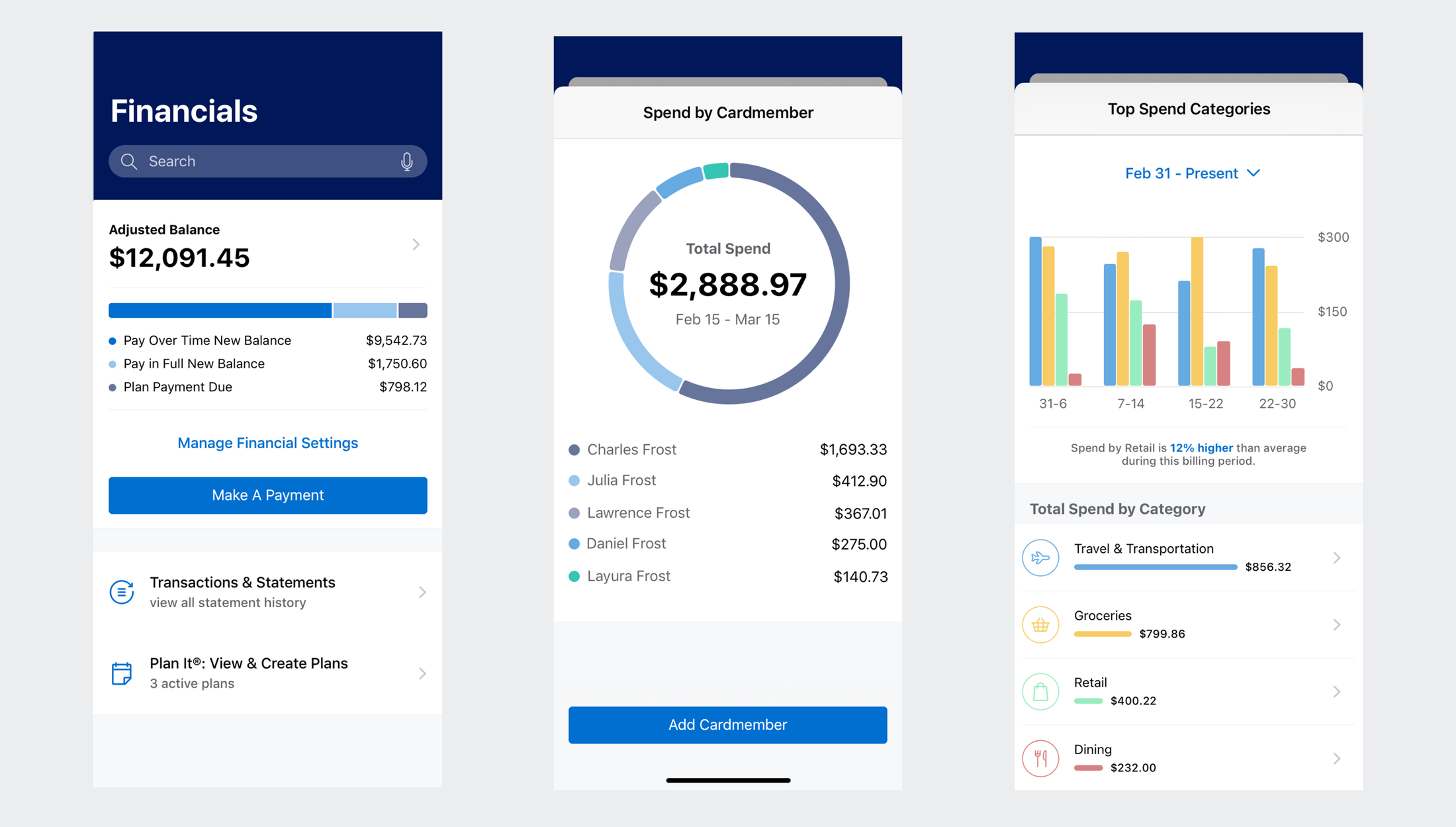
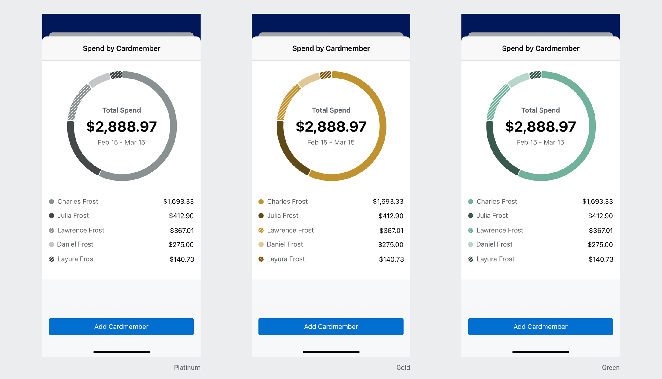
Dark mode was a success with over 40% of user adoption in the first year. American Express set a precedent by being the first major financial institution to implement dark mode in a mobile app, a step forward for accessibility and for reducing eye strain for our customers.