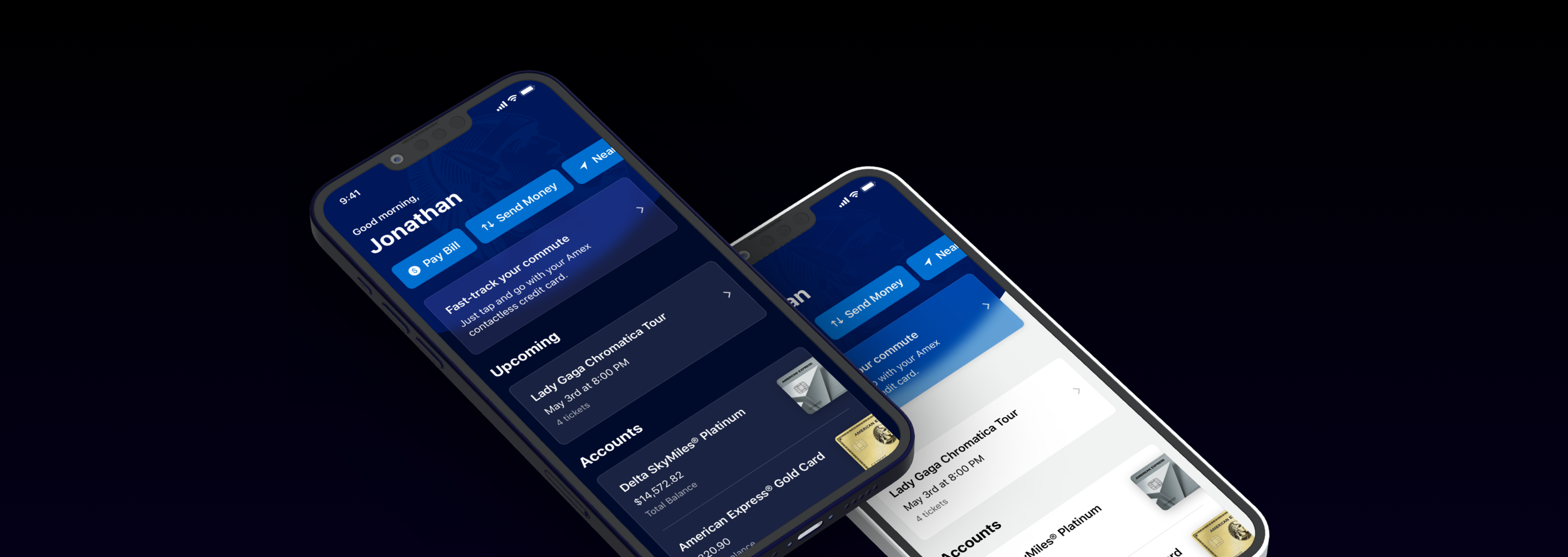
Dark Mode
Color system
American Express iOS | Android
My Role
Design Lead
Background
With multiple data visualization projects in flight, the design team needed to extend our current set of colors to use in charts. While exploring a system of colors for data, we took the opportunity to revisit our color system to increase accessibility and make dark mode — a top feature request from customers — possible.
Strategy
The first step was to chat with all the mobile designers and get an idea of current and future data visualization needs. The strategy was to design a system we could implement tomorrow but was flexible enough for the future while adhering to brand guidelines and the web channel’s design system.
Color Families
I grouped visualization into 3 color families:
General Data
Card Member Activity
Merchant Categories
Semantic Colors
While I explored adding more colors to our system, the idea of a semantic color system arose. By naming colors based on use rather than hue, the color palette could adapt to modes such as dark mode, high contrast mode, etc. With a shift in the product roadmap, we pivoted from data visualizations to focus on dark mode.
Base Palette
I began by extending our current color system into multiple shades and tints to make more colors available while staying within our brand guidelines.
Accessibility
Then it was time to build the semantic palette. Given that accessibility standards are higher for text than graphic elements, I broke the colors up into two categories: text/icons and layout.
Dark Mode
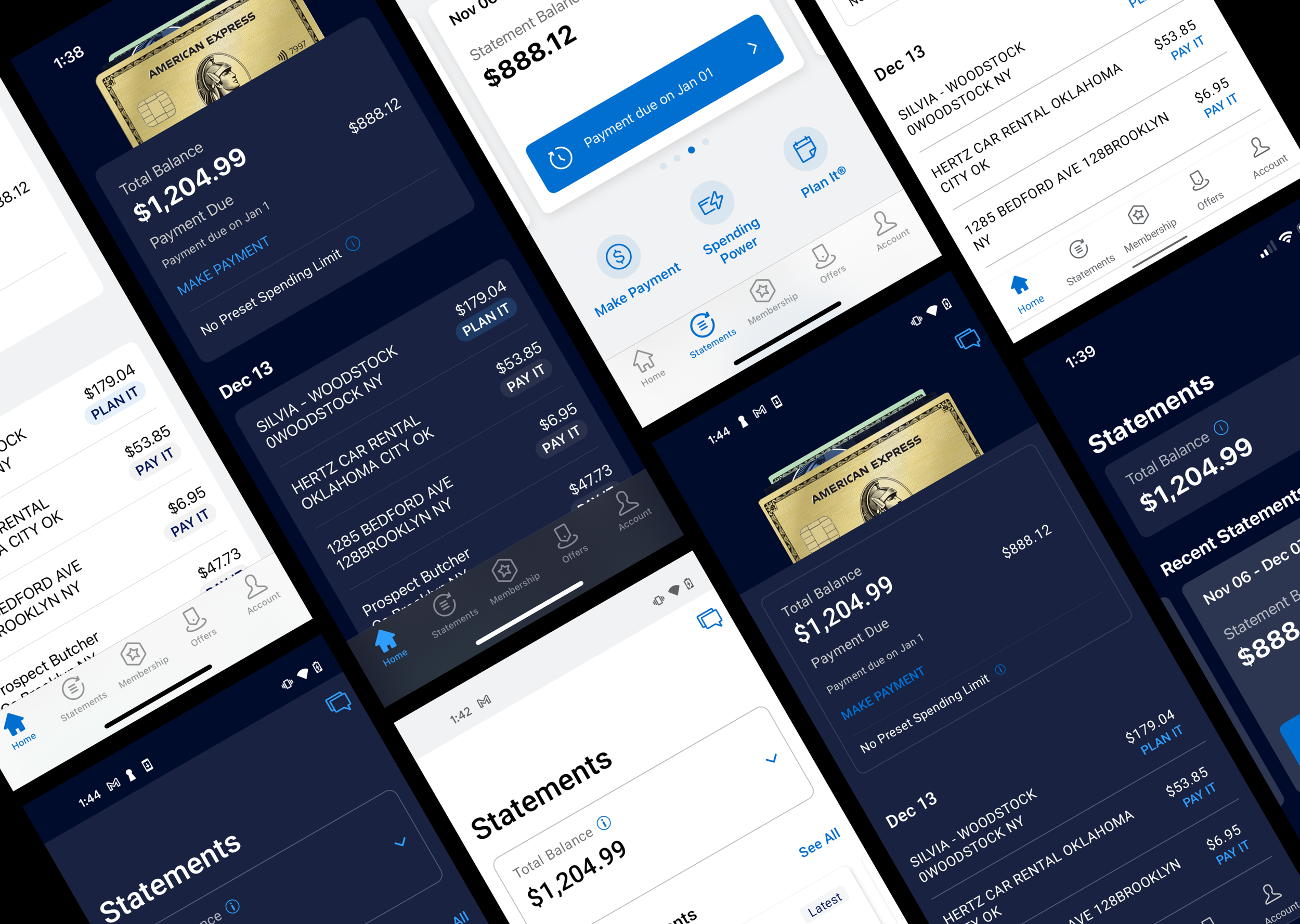
I created a table to document the color system across different modes. The rows were the semantic names and the columns were the modes light and dark. Each column had a color from the base palette that corresponded to the semantic name. Dark mode presented an opportunity to leverage our brand colors rather than simply using a black and gray palette.
Outcome


